Platform Components Design System
Project Role & Responsibility:
User Experience/UI, User Research, Product Requirements Documentation, Wireframes, UX & Visual Design, Prototyping (Axure Pro), Writing Functional Specs & Documentation for UX & Engineering Teams, User Testing & Demos (with Clients, Sales & Internal teams)
Lead the Product Design Strategy and UX lead for HTML5 Platform Migration project that influences global design direction for current and all future Enterprise financial apps.
Goals of Redesign
- Led end-to-end design and product strategy incubation to offer an easy-to-use UI Framework and toolkit that offers all core components (for designers and engineers), needed to design and build feature-rich financial applications
- Provided robust UX enhancements for current user pain-points
- Scalable toolkit for fast prototyping
- Gathered requirements and formulated functional UX specs
- Influenced product vision and strategy by defining design best practices, standard patterns (useful for auto-migration)
- Defined fluid grid to establish responsive design standards for multi-platform design implementation
- Introduced Font Awesome as icon kit for scalable vector icon sets, that are easy to customize in CSS
- Worked with engineers and architects to define functionality and review implementation feasibility
- Liaison between global UX and engineering teams

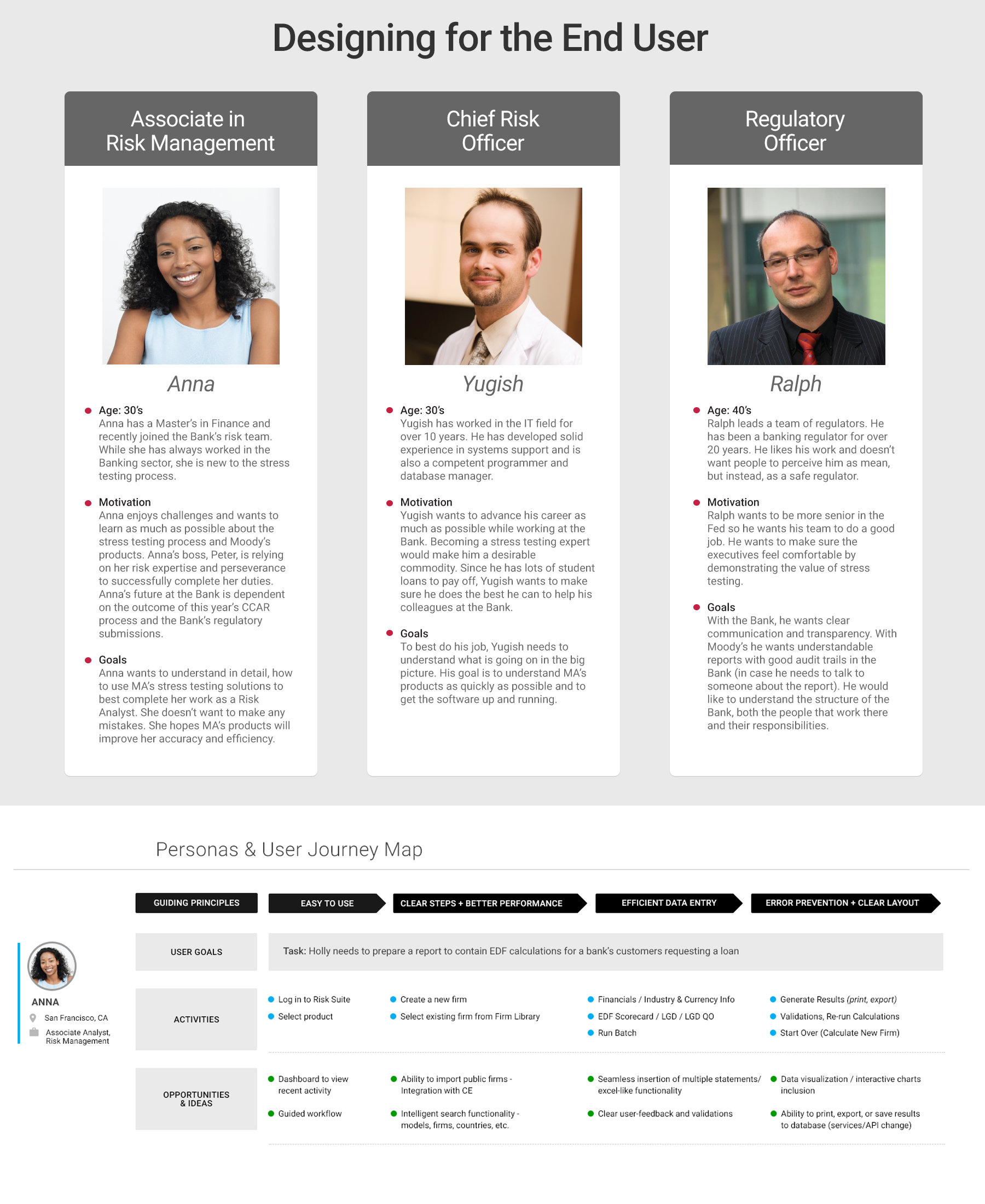
Designing for the End User
The following is placeholder text known as “lorem ipsum,” which is scrambled Latin used by designers to mimic real copy. Class aptent taciti sociosqu ad litora torquent per conubia nostra, per inceptos himeanaeos. Nullam sit amet nisi condimentum erat iaculis auctor. Vestibulum ante ipsum primis in faucibus orci luctus et ultrices posuere cubilia Curae.
Feature 2
The following is placeholder text known as “lorem ipsum,” which is scrambled Latin used by designers to mimic real copy. Vestibulum ante ipsum primis in faucibus orci luctus et ultrices posuere cubilia Curae. Quisque congue porttitor ullamcorper. Mauris id fermentum nulla. Aenean eu justo sed elit dignissim aliquam.
Designing for the End User
The following is placeholder text known as “lorem ipsum,” which is scrambled Latin used by designers to mimic real copy. Class aptent taciti sociosqu ad litora torquent per conubia nostra, per inceptos himeanaeos. Nullam sit amet nisi condimentum erat iaculis auctor. Vestibulum ante ipsum primis in faucibus orci luctus et ultrices posuere cubilia Curae.
