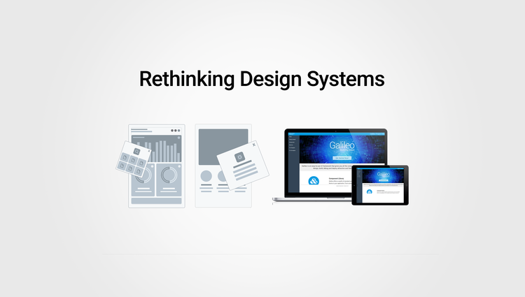
Rethinking Design Systems
An easy-to-use UI Framework and toolkit that offers all core components (for designers, engineers and cross-platform teams), used to design and build feature-rich financial applications.
my role
I led the User Experience and Design Strategy for Design Systems project. I created end-to-end design deliverables, formulated product requirements and spec docs for components used across all applications on global teams, prototyped product demos for sales and early client access as to gather feedback, and acted as a liaison between product, engineering, research and sales teams. I collaborated with Junior designers and cross-team product owners to gather feedback and understand various product pain-points.
Goals & User pain points
Our mission was to bring consistency, continuity and improve our overall process across various teams.
A robust design system helped identify several pain points.
‘Users at the Center’ - Identifying User Pain-Points (historic data and feedback)
Growing Need for Innovation with evolving Business Needs and Governance
Simplifying Development Methodologies (PROCESS BOTTLENECKS)
Address Design Inconsistencies & Business Continuity
Scalability & Adaptability with Newer Technologies
Lower Resource & Implementation Costs
Integrate Newer Technologies to Meet Industry standards and Market Competition
Accessibility Compliance
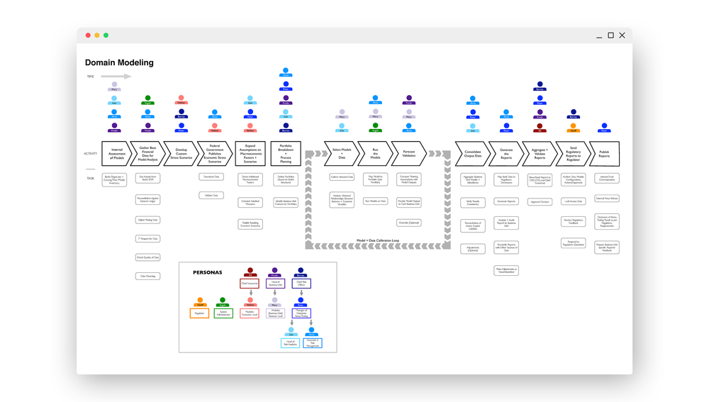
USER JOURNEY & DOMAIN MAPPING
Created comprehensive user personas and domain modeling map to understand user behavior. Detailed mapping helped understand business use-cases and overlapping patterns.

DESIGNING WITH EMPATHY IN MIND
We used personas constantly throughout this process to guide design decisions, set priorities, and understand complex pain points for both internal and external users.
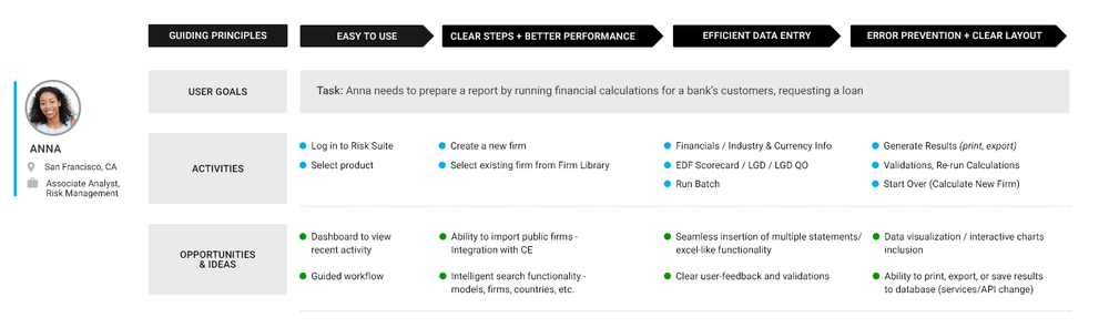
DETAILED USER JOURNEY MAPS
User Journey Maps helped identify common flows across applications and drive better design decisions. This also helped identify opportunities and explore new ideas for new features.
mindmap for apps
I created mind maps alongside developers and product owners to identify complex user flows, user stories, gaps, and architecture needs.

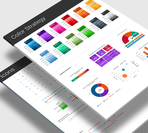
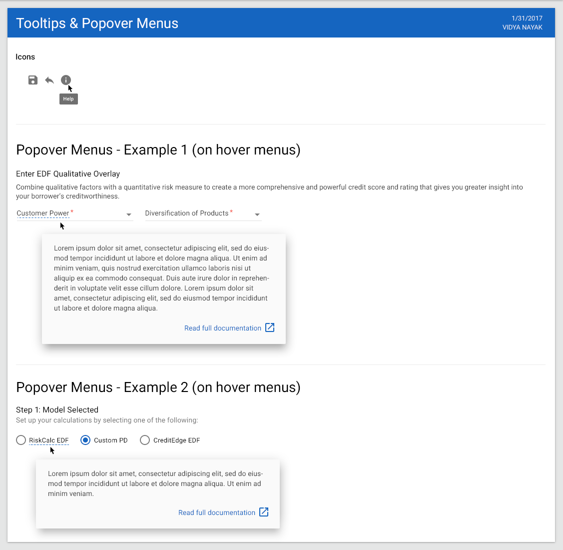
STYLEGUIDE & VISUAL DESIGN PALETTE
Styleguide and Visual Design best practices created for icons, buttons, charts, diagrams, and other visual design elements, that helped meet goals for consistency and continuity across all Moody’s applications.


product screen inventory list
We formulated a screen inventory and patterns list to identify common UX behaviors across 800+ screens in multiple apps

COMMON PATTERNS & interactions
Example of wireframe I created to identify common patterns and interactions
spec doc for notifications
Component Spec Doc for Designers and teams to use as reference

sample spec doc for designers & front-end engineers
I created spec docs and inventory list for designers, front-end engineers and QA teams to identify common components and how they will be used across all applications.

hi-fidelity mockup -
Analytics App redesign using Design Systems components. A seamless workflow using stepper component, iconography, chips for selection.
A shared and scalable components library initiative stemmed from the common components usage. Some of these listed below:
Common left nav component for navigation, an app chrome bar
Unified and seamless user access management (UAM) for Single Sign-On features
A consistent footer for all apps that enables branding, legal and copyright info and other shared elements across different products in the Suite.

HI-FIDELITY MOCKUP SHOWCASING DIFFERENT COMPONENTS
Model selection and favorite list system based on personas and permissions using components from the design systems, such as list component, chips, menu, buttons, icons, etc.

HI-FIDELITY MOCKUP for form components
Above example shows user flow for firm setup within a workflow
LEARNINGS & TAKEAWAYS
There is always room for improvement. Here is what we learned in the process
Design with Empathy
People feel connected when you empathize with them, take their feedback, and demonstrate that you care to solve those problems. Helps to build better relationships and establish trust.Get Buy-in
Tell a better story! For whom and why
When you establish trust, it also enables better relations and active interest in what you’re willing to offer. Helps in getting buy-in. Your internal users are critical in the process of gathering feedback. Listen to them.Bridging the Knowledge Gap
Buy-in and scaling solutions is easier when the knowledge gap is filled. Providing ongoing training sessions, and having a dedicated support team is extremely important in adoption and usageResources
Resource allocation and talent hiring (across the board) is important in empowering teams to perform their functions and set them up for success. Engage the right people. It is not the size of the team that is required, but talent, skill-set and grit.Customer Success is Key
Connect with Users on a Regular Basis - Understanding the pulse of the market is crucial, and the way to obtain this is to talk to end-clients on a regular basis, and get a sense of their pain-points and stories. Build relationships that further enables retention. Early testing of prototypes offers a huge advantage in gathering qualitative data.