Financial App Redesign
Redesigning Analytics App with a Simplified Workflow

Unified UI, Consistent Workflows (Material Design / Angular Material Framework)
RISKCALC PRODUCT REDESIGN (what)
Comprehensive default and recovery risk solution for assessing public and private firms and financial institutions (banks, aviation companies, etc.). A predictive framework with early warning signs to act faster and quickly towards future risks on loans
CUSTOMERS (who)
550+ Clients, 9+ years in business, mature product
Global clientele (large and mid-size banks and financial institutions) with US and Europe being the largest markets
Emerging market solutions for Middle East and Asia
CHALLENGES - Business & UX:
Increased subscription prices bring in new challenges for business as well as sales. Our goal was to achieve business objectives and improve user experience across the product suite.
Legacy UI migration from flex framework to Angular Material
Quick and easy ways to find and upload license-based data (Models, Country list, Financials)
Embedded Validations and User Feedback
Consolidated display of results summary, and results details (export feature, excel add-on, keyboard shortcuts)
Responsive design, and accessibility compliance
Security across all products within Suite - by way of Single Sign-on
Unified UI Across all Platforms (Consistency & Continuity)
Legacy Products Migrated to HTML5 (flex not supported by Chrome, IE)
My role:
Design simplified workflows to support various model data licenses
End-to-end UX design, user research, competitive analysis, user testing, rapid prototyping, design roadmap
Collaborate with designers, product managers, engineers, technical writers, customer success, research, sales, marketing, client support
Influence consensus and buy-in with stakeholders and cross-functional teams for new workflow adoption
Establish specs/guidelines for all designers under LOB to influence design system usage, consistency and continuity
Early Access Programs: Established early user testing programs with end-users and internal teams
sales & metrics success
Redesigned App launch grew our business by 13% thus exceeding our profits for year 2017-2018
In 2018, we also launched Small Business Initiatives. This initiative was developed using the same design and UI framework, thus reducing development effort and time

USER FLOW MAP
I created this user flow to help our team understand and identify edge cases, overlaps stemming from product integration and licensing, and plan for product features that could help resolve some of the current pain points. User flows also helped as reference to our new engineers and QA teams when testing different entry points during manual testing and plan for automation.
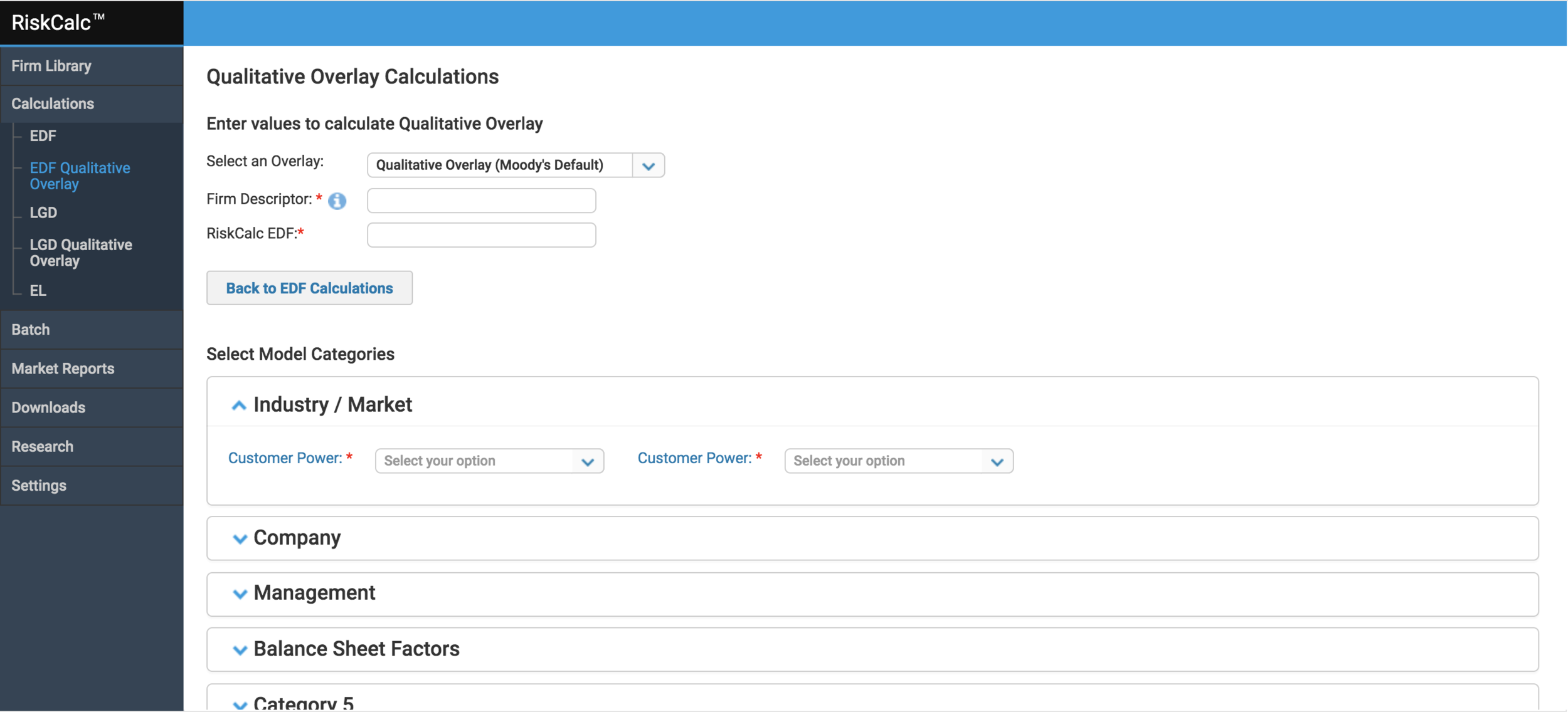
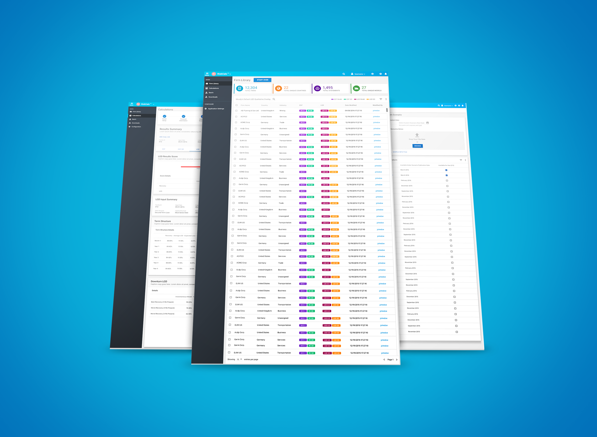
Old UI framework and designs
Above screenshots display the various steps in the calculation process.
Confusing entry points for calculations process
No clear direction on the flow or user prompts to validate actions. Users do not know entry and exit points in calculations
No error validations or user feedback
Visual design inconsistencies


New Authentication Process
I worked closely with the Software Architect teams to identify Single Sign-On across the Company, and a comprehensive authentication / oauth flow that includes licensing for each product, tokens, etc.

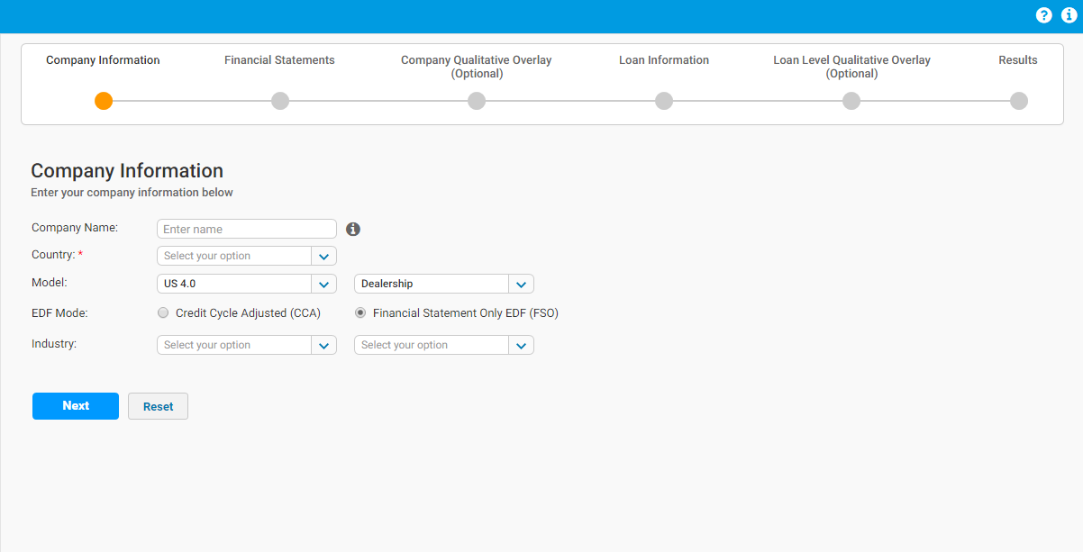
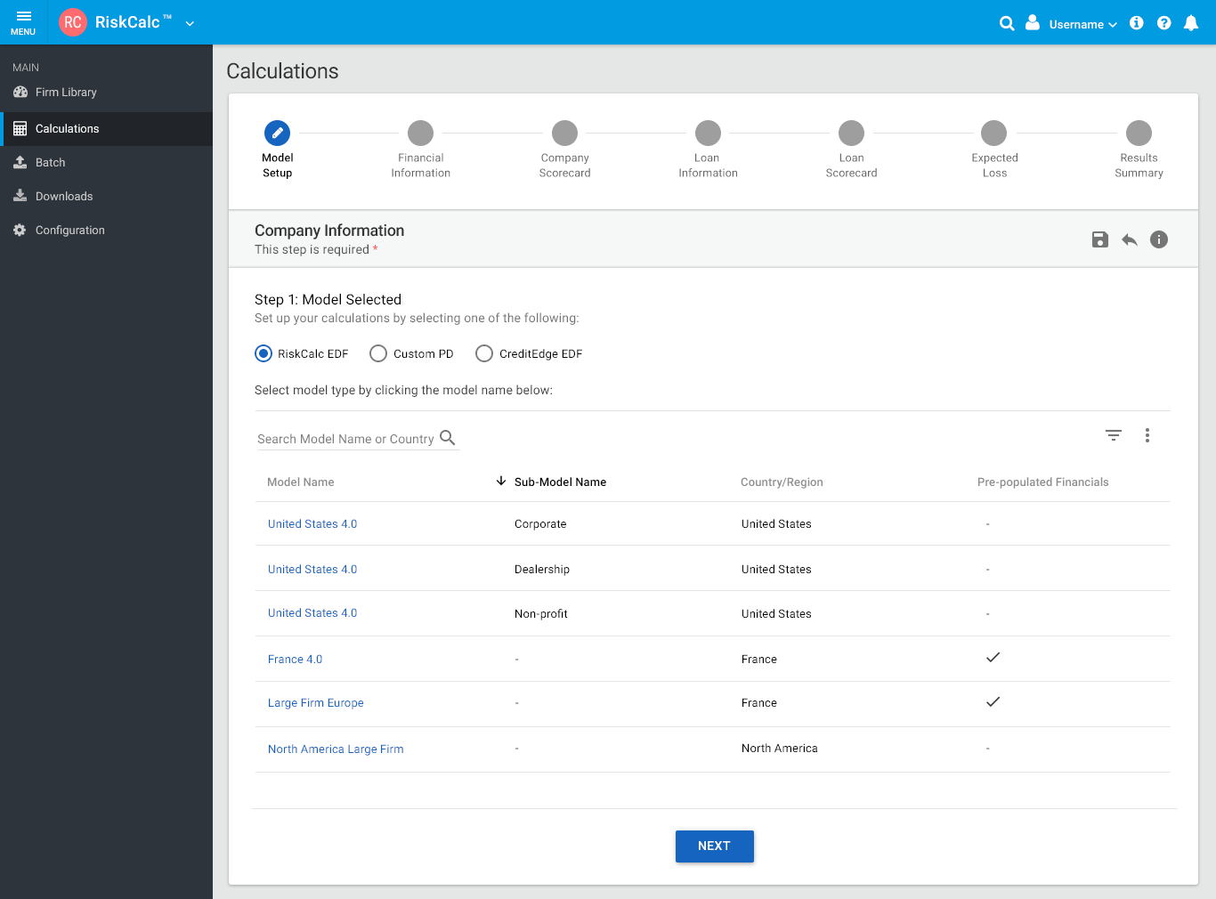
redesigned workflow - decisions madE:
Based on past data from client feedback, user interviews, and existing metrics, I redesigned the current calculations by introducing a guided and step-by-step easy-to-use workflow with enhanced user experience and embedded help text
Growing stakeholder and business needs spanned across upselling newer financial models to existing clients (e.g. supporting Emerging Markets, etc). The new workflow provides a sneak-peek of all model offerings and region listings, yet provides a secure flow based on user personas and licensing
Using the new design systems, I was able to meet both user needs and business requirements successfully
User testimonials and feedback was positive at webinars and post-launch
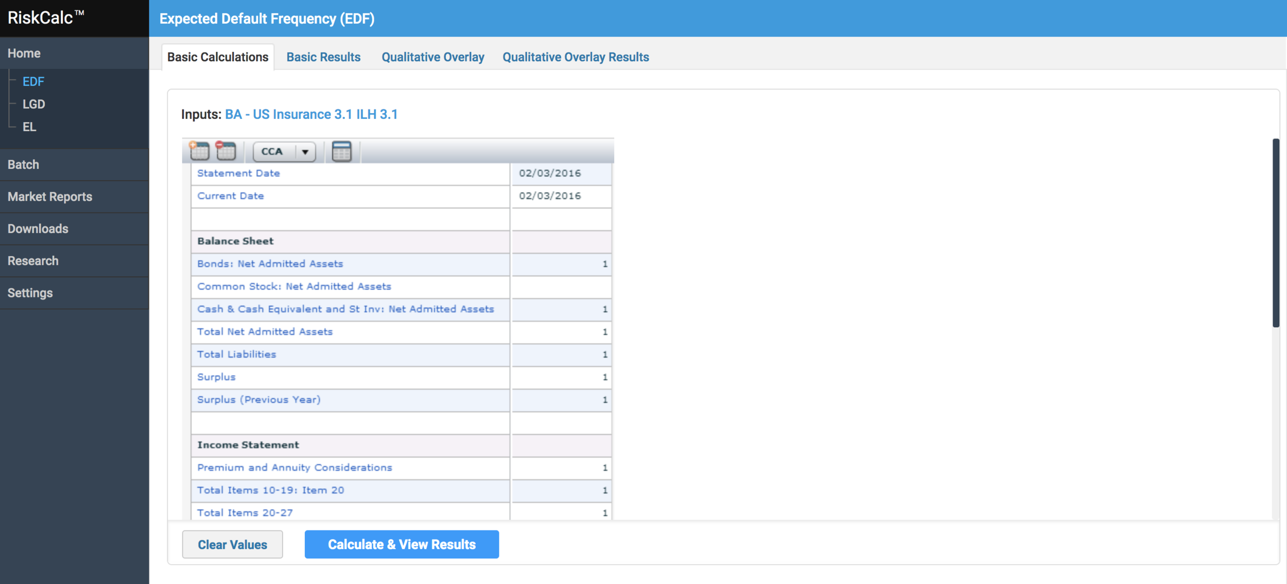
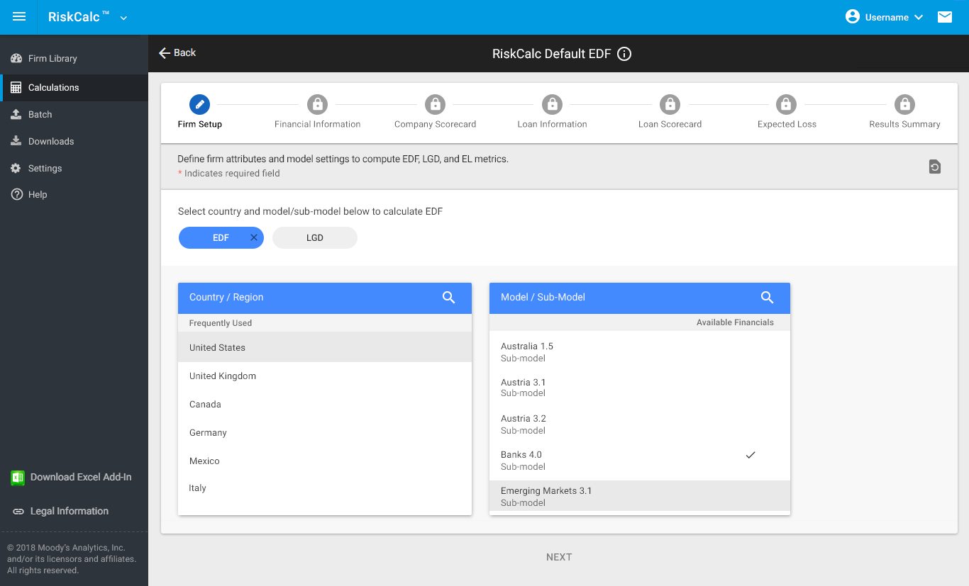
New Framework & Model Categories
My goal was to streamline model listings. The challenge was to display all combinations of 40+ models, by limiting the number of clicks, transitions and providing a seamless workflow to access different model calculations associated with a respective firm or portfolio name.


DESIGN EXPLORATION
Design exploration was iterative and took several enhancements to reach consensus across different teams involved
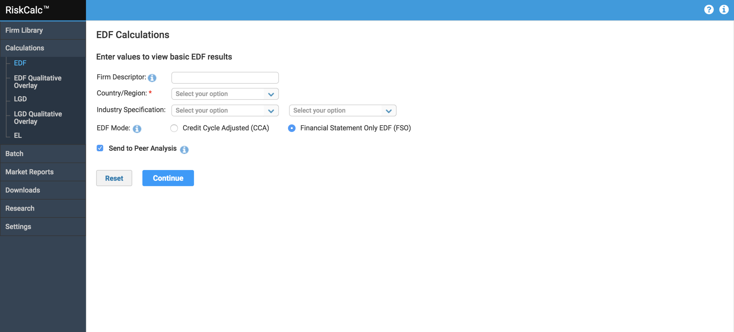
early access feedback:
We opened up early access program to a group of select users to test the model selection and workflow redesign
Although the first version of design provided a comprehensive list of models, users complained how difficult it was to access or different models, and country list. Scrolling was an issue.
We rolled back our first version and I redesigned the flow with a list component that provides guided access to country selection and model. This happens in a sequential format, which reduces ambiguity and friction
As our MVP, we launched a version with ability to access all models, and sub-models and save preferences for each firm name
Enhancement to old screens with better sorting, filtering and smart search functionality where user can look up applicable model info by entering keywords, and navigate to it's calculation flow.
Ability to offer audit trail and KPIs for quick view based on recent modifications to the library of firms


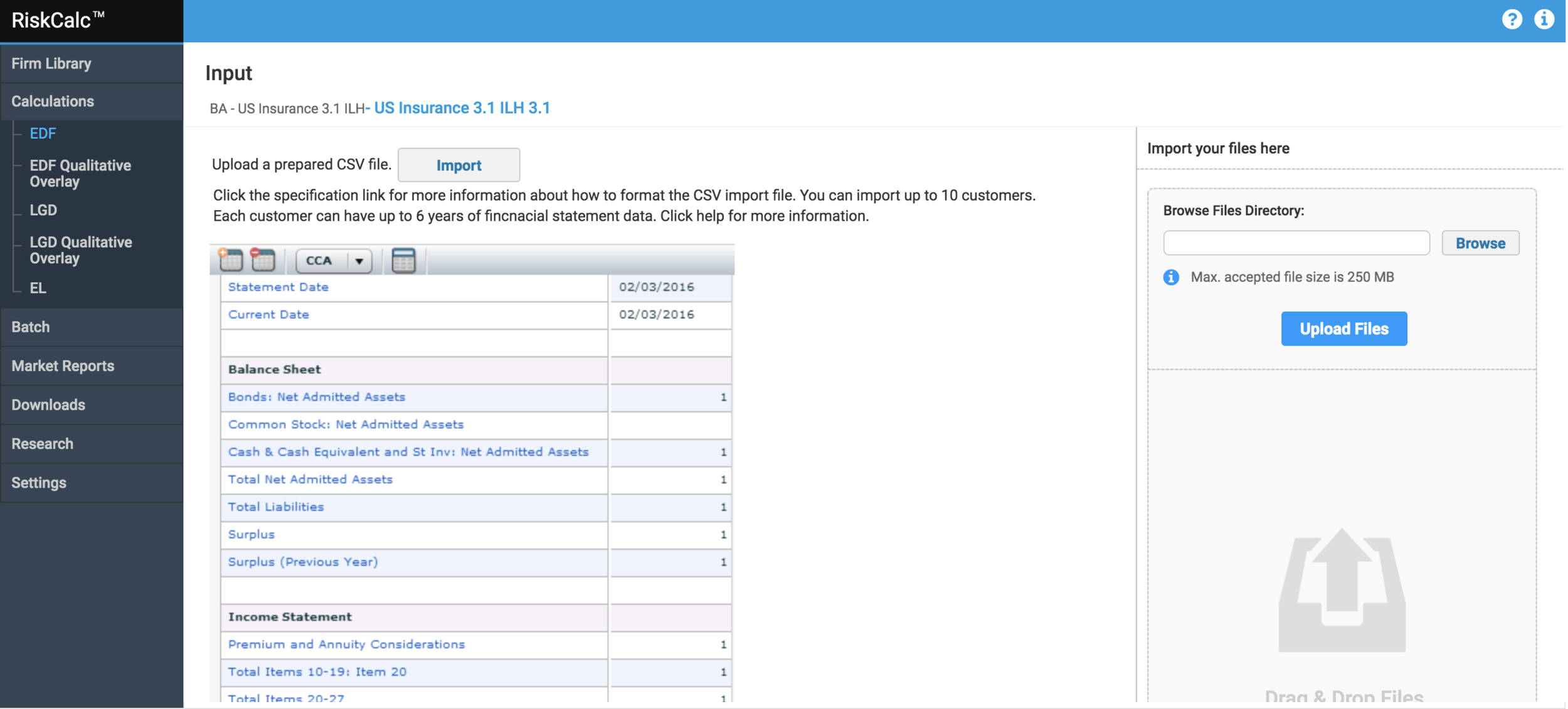
financial statement
This is an important step where users enter asset and income information or import previously included statements to calculate results
Users have the flexibility to calculate results (through single statement or multiple time-series) directly from this screen or proceed through scorecard questions in subsequent steps
I collaborated with product managers to understand what the business needs are, and how users would access this information
I worked closely with engineers and product managers to identify functional specs, explore Angular component capabilities and test different third-party plugins. We collectivey decided to use “handsontable” (a javascript library for spreadsheet grid components).
I then worked on using a Material design to re-skin this component to enable a cohesive and consistent UI
We tested few POCs with internal users and a small % of clients for functionality and ease-of-use.
Data gathered was used for iterative enhancements
It is considered “work-in-progress” as enhancements are yet to follow. We are in the midst of exploring optimal solution

A MARKETING PORTAL TO SUPPORT PRODUCT OFFERINGS AND MARKETING STRATEGY
I led the marketing portal design keeping in mind our business strategy and marketing needs across the company. Collaborated with Marketing teams and Content Manager, the portal now offers an ability to access different product offerings across the business suite, based on licensing and permissions. Enables great opportunity for UPSELL of other products within the suite.
Learnings & Takeaways:
Buy-in from all internal and external stakeholders is critical.
Redesigning a new app that is 8 years old and has 500+ clients can had challenges and can cause resistance among clients and internal users. It is important to gain confidence, and drive design by connecting users’ pain points with robust solutions, user testing and metrics.Always listen to user feedback. Offer a platform for them to provide timely suggestion.
ONGOING: We added a comments and feedback section on the app for users to send suggestions, file customer service tickets and raise any issues they experience.Host quarterly user interviews. These are extremely helpful in understanding how users think and use the product, and if certain feature needs future enhancements. This will help drive product roadmap efficiently.
I hosted product and UX webinars. Webinars are a good way to announce product launches, offer live demos, and share updates to UX and Product. Best way to offer live training sessions, educate users on the rationale so they are well informed. This enables client relations, trust building and retention
There is always room for improvement! My job as a product designer does not end here, but only begins. Alongside my team members, I am constantly striving to make this product experience better as we add new features in 2019-2020!